 " id="k8-modal-content" alt="modal">
Masterdata
Connect a master data element to your table and get automatically a master data form!
Configure the list columns and the form with JSON to get it functionally and good looking!
The data access rights are easily configured in the backend and displayed in the master data form.
User manual

Listing record functions:
- List
- Sort
- Filter
Crud functions:
- Create, New record
- Read, Load record
- Update, Save record
- Delete record
Export functions:
- CSV export
- Excel export
- PEF export
Configuration functions:
- Column order
- Column width
- Column selection
- Data read limit
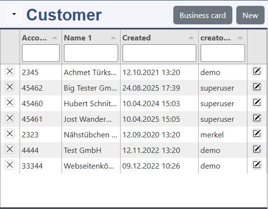
The form is devided into two parts. In the top is the record list with filter and sorting. In the bottom the record is displayed and can be edited in the form. You can drag the line between to enlarge or shrink the listing.
Listing Functions
Sort
Actually you can sort the displayed records. A callback for the server will be installed later.
Header filter
this are the filters:
- like (default)
- =
- >= or >
- <= or <
- !=
Column Order
With drap & drop in the column header you can move the colum to the desired position.
Column Width
Set the cursor between the columns. The Cursor changes to: <->By drag & drop you can adjust the column width.
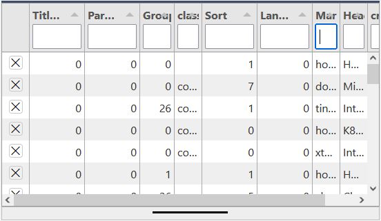
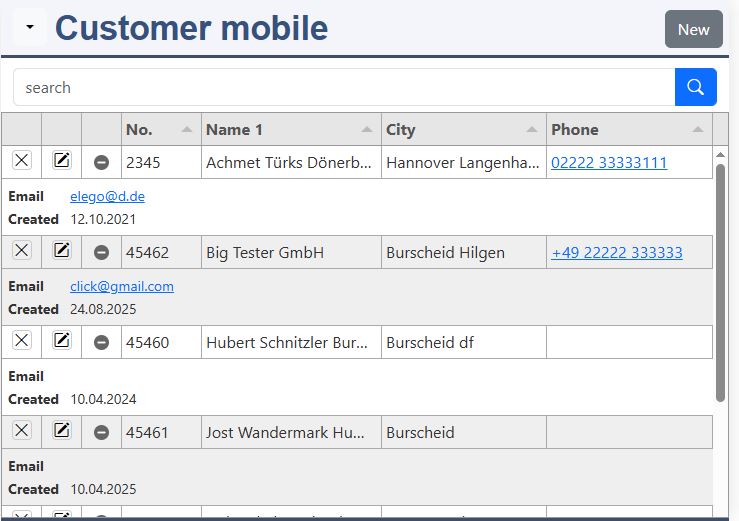
List
Each record ist displayed in 1 line. The columns are defined in the datadefintion of tabulator. The following symbols display the rights of the user:
 edit
edit delete
 blocked
Functions for the form
New
New empties the form. In future default values for the fields will be supported.
Edit (by Click in the List)
By clicking on the line the recordset is displayed in the form and can be edited. Independent from the displayed columns in tabulator the whole record already loaded in the row. A new load from the server is not necessary.
Cancel
Cancel undos the changes and displays the original record.
Save
Before saving the data a validation by jsonform is done. If its failed you first have to correct the values. In future the data-access-class will do a validation check for the fieldtype and the user rights. Other checks have to be progammed by yourself.
Delete (X click in the List)
The user rights are implemented. If the ban is displayed, deletion is not allowed. After a confirmation question, the record will be deleted. The form displays an empty record.
Dropdown Menu
Options:
- utf-8 CSV Export
- Excel Export
- PDF Export
- Set read limit
- Choose columns
- Save configuration
- Reset configuration
- Multi select, set on
Utf-8 CSV Export, Excel Export, PDF Export
You can download the displayed data in the desired format. If not all lines are displayed, please change the record read limit.
Set read limit
You can change the record read limit to an arbitrary value. The read limit is valid until you load a new page.
Choose columns
The Choose colmns dialog allows you to choose the displayed columns.
Save configuration
With "Save configuration" you save (only available when loogged in):
- the choosen columns, the order of the columns and the the column width.
- the filter
- the height of the tabulator list
Reset configuration
(only available when loogged in)
By reseting the configuration the default columns, its order and with is set to default.
Multi select on
For some special functions the selection of 1 line can be changed to multi line selection.
Developer
Table requirement: primary key of the table
A table for master data has to fullfill the following rules:
- the Primary key has to consist of a single field
- INT, autoincrement
- creatorID (by using the data access rights )
- INT
The primary key is a hidden field in the master data form. It can not be changed!
Masterdata form on the fly
Checkout the generation of a masterdata form on the fly:
- Customer table on the fly:
index.php?table=er_customer&page=masterdata - Item table on the fly:
index.php?table=k8components&page=masterdata
Attention, generate a table is only allowed on this demonstration page. This functionality is normally turned off!
Open data definition as page
you can open the datadefintion as:
- masterdata form:
index.php?datadefID=customer&page=masterdata - list:
index.php?datadefID=customer&page=list - form:
index.php?datadefID=customer&page=form
Create a data definition out of your table
The data definition contains details for reading, saving and displaying a recordset.
The following steps are necessary to create your own data definition:
- er_customer, if not exist create it with "k8examples.sql"
- generate your data definition
- table: er_customer
- datadefID: mycustomer
- get_data definition.php?datadefID=mycustomer&table=er_customer
- folder <myproject> create a folder: mycustomer
- save the data definition in your folder mycustomer with the name "mycustomer" as json file.
- look in your browser:
index.php?datadefID=mycustomer&page=masterdata
kitsamples/customerbasic/customerbasic.json:
Datadefinition
Properties and sections:
- name: the displayed name
- key: necessary for edit
- rightcheck: with RBAC, look to the explanation
- columns: the definition of the table columns
- masterdata: the main parameters
- tabulator: the list, please have a look to: tabulator.info
- k8form: the form, please have a look to: k8form
- html: the html snippets
- data: for form only
To change the look of your masterdata form, please configure tabulator (list at the top) and k8form (form at the bottom)
JSON structure:
The key column is used for edit functions. If the key value is zero, it's a new record.
rightcheck=1The backend adds automatically:
settings.masterdata:
- right_usercreate: "0" or "1"
recordset
- right_userupdate: "0" or "1"
- right_userdelete: "0" or "1"
add JavaScript to your datadefinition (optional)
add JavaScript files:
head[]
This tags are added in the head of the web page. Here you can declare additional libraries or files.
head_end[]
The tags are placed behind the declaration of your datadefinition. Here you can add JavaScript function to your datadefinition.
foot[]
This are inserted after your web page is displayed. Use it to add JavaScript events to HTML tag.
foot_nodefault: true/false
Normally the "js/example.js is called to add your defined element to the web page. If "foot[]" is declared, this file is not called. If you still want to call example.js, please set:
- foot_nodefault: false
add CSS, Stylesheets to your datadefinition(optional)
add CSS files:
head[]
With this reference in the head you link a CSS file to your page. The file need to be placed there:
- local developement area
- in elements online (folder): add File
Name of the file:
- <datadefID>.css
More to CSS:
- local developement area
tabulator, basics
This is a part of the customer tabulator definition (string columns):
The most often used column properties are:
- title - Required This is the title that will be displayed in the header for this column
- field - Required (not required in icon/button columns) this is the key for this column in the data array
- headerfilter - true for more details look in the tabulator documentation
- visible - (boolean, default - true) determines if the column is visible
- hozAlign - sets the horizontal text alignment for this column (left|center|right)
- headerHozAlign - sets the horizontal text alignment for this columns header title (left|center|right)
- width - sets the width of this column, this can be set in pixels or as a percentage of total table width (if not set the system will determine the best)
- minWidth - sets the min width of this column, this should be set in pixels
- formatter - Tabulator offers a wide range of formatters for strings, numbers, dates, ...
- formatterParams - additional parameters you can pass to the formatter
For more details look to:
Columns can easily removed or added. if desired you change the order of the columns. If you extend the sql-statement, you can easily add the columns here.
tabulator, local formatting
Example for date and number:
The formatting of dates and numbers depends on the settings of the clients web browser. K8 Web Kit reads this on the first page request and sets it in the session variables. This are the corresponding JavaScript variables:
- GLOBALS_decimal_point
- GLOBALS_thousands_sep
- GLOBALS_tabulatordateformat
- GLOBALS_tabulatordatetimeformat
- GLOBALS_tabulatortimeformat
The date and time formats follow the luxon syntax, date time format:
- 'dd.MM.yyyy HH:mm'
tabulator, responsive
K8 Web Kit uses this basic configuration for the tabulator layout:
- "layout": "fitColumns"
The table generator sets all column counts > 8 to visible: false. On small screens the columns even can be too small to read it well. So, better set a min width (minWidth):
- "columnDefaults": { "minWidth": 100 }
- or for each column:
- "minWidth": 100
By too few space a horizontal scroll bar is displayed.
To improve the responsive layout, use the following settings:
- "responsiveLayout": "hide"
- "responsiveLayout": "collapse"
tabulator, responsiveLayout: hide
By default, columns will be hidden from right to left as the width of the table decreases. You can choose exactly how columns are hidden using the responsive property in the column definition object. When responsive layout is enabled, all columns are given a default responsive value of 1. The higher you set this value the sooner that column will be hidden as the table width decreases. If two columns have the same responsive value then they are hidden from right to left (as defined in the column definition array, ignoring user moving of the columns). If you set the value to 0 then the column will never be hidden regardless of how narrow the table gets.
tabulator, responsiveLayout: collapse
If the columns no longer fit in width, they are placed one below the other as a pair of values.
More:
tabulator, initial sort
example for a status field:
The basic sort declaration can also be made in masterdata sql_orderby. When it's made in tabulator, the sort icon is bold.
sortMode
Without a declaration the sorting is processed local:
- local (default)
- remote, by each sort the sort array is added to the data request:
- sort[0][field]=name1&sort[0][dir]=asc
initialSort[]
- column
- dir:
- asc
- desc
tabulator, select
example for a status field:
headerFilter: list
This defines a select field in the header filter.
headerFilterParams
The headeFilterParams define the values, which can be selected.
formatter:#function#k8tabulatorformatter
The k8tabulatorformatter allows to define values, which are displayed with the "text".
formatterParams
The value list contains the "text" property, which is displayed.
tabulator, add a control button to the row
add a button column to your JavaScript file:
formatter()
With the formatter function the HTML is defined. It's a button with the bootstrap icon: "bi-display".
cellClick()
By a click on the buttion this function is executed
- With cell.getData() the data of the row is set to "dat".
- "window.location.href" open the given url.
- The query parameter "displayvalue" is set to "dat.coursenumber".
k8form
This is an part of the customer k8form definition:
The most often used column properties are:
- tagName - default: input This is the tag of the form element. Other supported tags are:
- select
- textarea
- button
- type - for input, button most of the HTML5 input types are supported
- name - Required This is the name of the database column
- label - the label of the form element
- decimals - the decimals by type=number
- attributes{} - additional attributes for the field
- maxlength - the maximum allowed charaters of the field
- required - defines if an form element is required
- disabled - defines if an form element is disabled
- inputgroup - declares an inputgroup, a bootstrap 5 element, consist multiple elements
- options - for select defines the options of a select element
Thanks to the container property of k8form HTML layout can be managed and fieldsets or multiple block can be displayed.
For more details look to:
k8form, fieldwraptemplate
fieldwraptemplate for horizontal forms:
This template is used as default.
fieldwraptemplate for the whole width:
Use this template, for the whole width of the form.
fieldwraptemplate in the fields definition:
The HTML needs a special formatting for the JSON data structure:
- remove all line breaks
- escape special characters like double quotes inside the HTML with \"
k8form, 2 blocks
masterdata/templates/datadefinition_k8form_2blocks.json:
Bootstrap needs 3 containers to create 2 blocks:
- class: row
- class: col-sm-6
- class: col-sm-6
k8form, datalist (example: employee)
datalist example for employee "address":
"Address", name: "gender"
This field allows any entry to address the contact person. The "list" attribute points to a "datalist". In the data list you will find suggestions for field input.
"datalist", id: "gender_datalist"
Here are the suggestions for the field input listed. This "tag" is not displayed in the form. It has no label.
So the "fieldwraptemplate" only consist out of the "fieldelement". It also has no "class" -> the fieldclass is set to empty.
The "id" is same to gender attribute "list".
The "tagName" is "datalist".
In the "innerHTML" the options (list entries) are defined as HTML elements.
k8form, select
example for a status field:
tagName
To select values out of an option list, you have have to declace a HTML tag: "select".
options
The options list allows you to define value pairs (value, text) to select from. If the text should be saved in field and table, you don't need a value.
k8form, inputgroup, click events
Datadefinition: the inputgroup allows to put 2 or more elements in 1 line:
The k8form definition determines the layout of the inputgroup.
The inputgroup in this examples consist out of 2 fields:
- HTML for click
- class: js-action-item
- innerHTML: @
- data-action: your action
- field: tagname
JavaScript for the action:
JavaScript determines the action to be performed.
The programm code is placed into the call back cbCreateStructure:
- add an event listener on click to all elements with the class js-action-item
- variable action is set to the dataset action
- variable dat_form[] contains all values of the form elements
- write your program code in the right case of your switch statement
k8form, button group
Datadefinition: the button group allows severtal buttons in a row:
The buttons in the inputgroup can be adjusted with the class:
- text-start: at the left (attention: margin to the right)
- text-end: at the right (attention: margin to the left)
Without the class input-group the buttons are separated from each other.
The button group use the same properties like inputgroup:
- class: js-action-item
- innerHTML: different icons
- data-action: your action
JavaScript for the action is same like by the inputgroup above.
k8form, dropdown
Datadefinition: the dropdown is part of an inputgroup, first the dropdown and right beside the input element:
The k8form definition determines the layout and dropdown items.
The inputgroup consist out of 2 fields:
- HTML element for the drop down
- input for the customer name
The htmlelement is set to "dropdown". The property for the data structure is "dropdown". The k8form generator creates the necessary HTML for it.
The main properties of the dropdown are:
- button: styling of the button
- items[]: array with the items:
- value
- label
The HTML tag for an item:
- class="dropdown-item"
- data-value="edit"
JavaScript can process the clicked element well with class and data-value.
JavaScript for the dropdown-item:
JavaScript determines the action to be performed.
This is the programm:
- Please specify your form in the first line.
- To all elements with the class dropdown-item an event listener on click is added.
- In the event the data-value of the target element is set to the variable: action.
- In the switch statement the specific programm code for the icon is processed.
- In the event the data-value of the target element is set to the variable: action.
- To all elements with the class dropdown-item an event listener on click is added.
In the edit case the url is set. If a customer (accountname) is filled out, the query parameters are added and a new tab is opened. The new tab will show the customer record in the master data form.
datadefinition for "checkbox"
columns:
Example for active
Consider copying and pasting the column names to change them!
In the database a checkbox is saved with the values: 0 / 1 for false / true.
"mytype": "BOOLEAN"
Setting "mytype" to boolean is important for filtering and building the clause.
tabulator:
headerfilter
headerfilter and headerfilterParams define how the headerfilter is displayed and processed.
formatter
formatter and fomatterParams define the representation in the line.
k8form:
checkbox
The label is displayed behind the checkbox. The value is important; it has to be: "1".
masterdata, default values:
defaultvalues
The default value by a new record is in this example "1".
masterdata
defaultvalues
The defaultvalues allows to set default values for a new record in the form.
clause
The clause allows to filter the data.
url_...
- Ajax
- load
- read_filter
- save
- del
- Dialog
- new
- edit
- master
- detail
edittype
- 0 no controls
- 1 insert with reload (only catalog plugin)
- 2 innerHTML (form_selector)
- 3 overlay
- 4 new tab
- 5 new window
- 6 own line in catalog template (only catalog plugin)
- 7 own line with special template (only catalog plugin)
- 8 master data form
- 9 link in this window
Calculated field / column
A calculated field needs to be added in:
- datadefinition
- columns
- masterdata.sql_additionals
- tabulator
- k8form
- JavaScript
- call back: cbChanged with the calculation
The simplest approach is to create the calculated column in the table. Generating the data definition adds the column to all parts of the data definition. The formula then needs to be implemented in JavaScript.
Without the calculated column in the table, the column needs to be implemented in all parts of the datadefintion.
In this example the column price_gross is calculated with the formula:
- price * vatclass
Implement the formula in JavaScript
JavaScript with call back function cbChanged (kitsamples/k8components_head_end_array.js):
The formula will be calculated after the changement of the according fields in the form. Therefore the call back function is provided.
switch checks which fields are changed. In the case of:
- vatclass
- price
the function price_gross_calc is called and the result is set to the variable price_gross.
options.dataform.update(...) updates the form and sets the form element price_gross.
datadefinition.k8form:
In the attributes of the field "price_gross" the property disabled is set to true to avoid data entry.
Without the calculated column in the table
add it in datadefinition columns:
price_gross is added in the columns with the right data type.
add it in masterdata sql_additionals:
The formula for the sql statement is added.
add it in tabulator columns:
price_gross is added in tabulator columns with a numeric formatter: money to define the decimal places.
add the calculation formula for tabulator with a mutator in JavaScript:
In the tabulator column a mutator with the calculation function price_gross_calc(data) is added.
SQL statement
sql_derived example:
Please write the sql_statement or sql_derived in the datadefinition in one line (JSON compliant)!
The "sql_derived" property is important by using the view with tabulator, otherwise the property "sql_statement" should be used because it's a little bit faster.
The placeholder are:
- §select: additional fields are inserted:
- rightuser_update
- rightuser_delete
- '' as k8select: same §select
- §dateformat: the SQL date string is inserted
- WHERE 1=1: Where condition, here the "WHERE ".$clause is inserted
- §userID: $_SESSION['userID']
- §clientID: $_SESSION['clientID']
- §companyID: $_SESSION['companyID']
- §domain_language: $GLOBALS['domain_language']
Alternatively the include "getEntries_sql" can be used to write the statement direct in php.
Avoid to extend the sql statement (select or from section) in the properties: sql_statement or sql_derived. Please, use sql_additionals instead.
the column array is extended by additional columns:
columns
If the sql statement is extended with new columns, the data type needs to be declared, to get a correct filtering. Without declaration the columns are treated like 'VARCHAR'. It's also necessary for a list of available columns, like in the chartjs assistant.
In the example above, the column note is added. It is treated as boolean field. The fieldname is set; the "Field" column is only set for table columns.
sql_additionals:
select
The select part contatains the colums:
- <column name>: expression
aggregat
The columns with the aggregation are added by the chartjs assistant to the sql statement (sql derived).
from
The from part contatains the joined tables:
- alias or table name
- table: table name (default: alias)
- join: LEFT OUTER JOIN (default)
- expression: the ON part
groupby
The groupby part contatains an array of the columns[]:
- "column1","column2"
By extending the SQL statement in a JSON data structure, it's handling and readability are simplified.
Call back functions
Extend the datadefintitions with call back functions:
the parameters:
- settings: configuration of the element
- el_md: the masterdata html element
- dat: the record with column value pairs
- e: the event
- el: the source element
- selected: the selected rows
- row_actual: the current row
- bnew: true/false (cbAfterSave(
add tinymce
masterdata/templates/tinymceset.js
Create your datadefintion JavaScript file. Copy the line from the template into your file and add your datadefID to the settings variable.
additional declarations in the datadefinition:
In the head of the page you have to add:
- the tinymce library: tinymce/tinymce.js
- the tinymce template: masterdata/templates/tinymce.js
After the declaration of the JavaScript variables at head_end the call back functions are added to the datadefinition: settings. The JavaScript file for this is masterdata/templates/tinymce.js.
In "k8form" the textareas with the class tinymce will get the tinymce editor.
The image list for tinymce is initialized by the init of tinymce. By each record the image_list changes, so tinymce is removed and initialized again.
The tinymce template consist the call back functions for your form. If you need to extend the call back functions or change the configuration, just copy the template in your datadefinition folder and change the link in your datadefinition.
More information about tinymce are in: TinyMCE docs
Update tinymce
The steps to update a tinymce field are:
- remove tinymce
- updata the field
- init tinymce again
add image support
additional declarations in the datadefinition:
The upload has to be enabled (true). The settings specify the details of the files to be uploaded.
Frontend
the following elements are added into the masterdata plugin:
- Upload area for the image
- Image list with with sorter and control elements
If tinymce is enabled the image list is also displayed and updated in tinymce.
showtext
"true" displays the filename.
minImageWidth, minImageHeight
The min values ensure that a minimum resolution is guaranteed.
resizeMethod
- contain:
- the image dimensions are scaled down to the specified values.
- the aspect ratio of the uploaded image is retained
- crop:
- the image dimensions are croped to the resizedWidth and resizeHeight
- the aspect ratio corresponds to the resizedWidth and resizeHeight
Backend
by reading the main recordset, the following columns are added:
- image_ID
- image_file
- image_orientation
- image_aspectratio
- image_width
- image_height
- image_count
- image_array
- array with images, same the columns above
add upload support
additional declarations in the datadefinition:
The upload has to be enabled (true). The settings specify the details of the files to be uploaded.
"datadefID":"k8refrights"
This are the differences:
- files are saved in column: fileblob
- rights: limit to creator, client or company
- PHP file to read fileblob
Open image modal
Add the class: js_k8-modal to your image:
Open the image modal means to open it by click as large as possible in your browser window. Here for add to the image the class:
- js_k8-modal
The necessary k8-modal tag is added in "_header.php". The CSS is in masterdata/css/masterdata.css.
After your image is loaded bind the modal event listener to display the image modal:
Call back function:
- cbcatAfterLoadAll(...)
Add modal event listener:
- addEventListenerModal(...), by all elements with the class js_k8-modal the modal event listener is added
More details to modal images:
add Bootstrap tags
data definition:
head[]
JavaScript library and CSS are linked.
fieldclass_add
All form elements get the class js_usebootstraptag.
JavaScript:
The form events
cbAfterNew
All form elements with the class js_usebootstraptag are emptied or filled with the default values.
cbAfterLoad
The form elements with the class js_usebootstraptag are filled with the tags of the record.
add codemirror
data definition:
codemirror libraries and styles
The additional JavaScript libraries and style sheets are declared in the head section.
codemirror modes:
- javascript
- htmlmixed
- text/css
- application/json
- text/x-mysql
- application/x-httpd-php
- php
- xml
More
- codemirror
- jsonlint.com, a validator and formatter with codemirror as core
JavaScript, codemirror initialization:
initCodeMirror(..)
- el_texteditor
- content
- options
- mode: used modes are listed above
- ...: look in the codemirror link above
configuration:
- setSize(), set the height of the editor
- setValue(), sets the content
- on(changes), used to write the content to the textarea and set the dirty flag
JavaScript:
The cbCreateStructure
codemirror is initialized.
The cbAfterLoad
codemirror content is set.
The cbAfterNew
codemirror content is set to default (empty).
The cbBeforeSave
codemirror is validated.
CSS for resize:
Classes for resizing
The resize class is added into a parent of the textarea predesigned for codemirror:
- k8-codemirror-resize-both
- k8-codemirror-resize-horizontal
- k8-codemirror-resize-vertical
- k8-codemirror-resize-none
dropdown Menu (in title row)
menuleftobj, for more details go to dropdown.
Options menu by menuleft_options:
- true / false: displayed / not displayed
- [1,1,1,1,1,1,1,1]
- 0: not displayed
- 1: displayed
- 2: disabled
displaymodes (true by default):
- inlist (displayed in master data form or list)
- inform (displayed only in form)
- atlist (displayed only in a different form by a link)
A dropdown entry can also placed as button in:
- btn=1: headline
- btn=2: button line of the form
Call back function, cbMenuleft:
For each item the programm code needs to be written. The item is defined by the attribute "value".
Example copy (datadefinition)
extend menuleftobj
New menu item:
- copy
Example copy (JavaScript)
extend menuleftobj
By the value: "copy" first the selected row and the dirty status of the form is checked.
Finally the record need to be saved manually.
html
The html snippets define the markup and the looking of the master data form. To overwrite the default snippets, define your own snippets.
This are the possible snippets:
- layout
- wrapper
- headline
- filterformwrapper
- tabulatorwrapper
- formwrapper
- main
- footline
Create the HTML-Files with names like this:
- <datadefID>_<masterdata>_<property>.html
In the JavaScript datadefinition the snippets are in "settings":
- html.masterdata.<property>
Please regard in your snippets the classes:
- "masterdata"
- "tabulator"
- "js"
- "js_dirty" for the edit symbol
- "js_middle" for the message by messages mode<>4
- Save button needs to be: type="submit"
- Cancel button: class="js_cancel"
example for side by side, <datadefID>_<masterdata>_wrapper.html
To use the full browser width, add this selector in your datadefinition:
if you place tabulator and form side by side, use the full height for tabulator:
An example for a side by side form is in "kitsamples/customerleft". To optimize the looking, add a CSS-file.
data
data is only supported in form mode (notabulator:true):
Linking <select> by page init
In this example the table column: categoryID is linked to the table k8groups. This are the crucial columns of the table k8groups:
- groupID: primary key
- title: column to display
- type: 'customer_group' for the default clause
Requirements for the data definition:
- optionsadditional[]
- datadefID the source datadefinition need to be declared
- column_mapping
- fieldname
- tabulatorcolumn
- emptytext
- defaultclause
- masterdata, sql_statement
- the column "category" with the title can be joined for catalog output
datadefID:
- The datadefID of the source datadefinition needs to be entered here: k8groups.
column_mapping:
The HTML select tag has options:
With the column mapping the options are filled easily, column_mappping:
- {"placeholder / attribute":"table.column"}
- {"text":"title"}
- {"value":"groupID","text":"title"}
- {"value":"groupID","text":"title","data-columnXYZ":"columnXYZ"}
fieldname:
The field name of k8form: categoryID
tabulatorcolumn:
The field of the tabulator columns: categoryID
emptytext:
- none (default)
- standard (please select)
- your text
An empty text is only shown in mode 1. In mode 0 you get an empty option instead.
defaultclause:
The "defaultclause" allows to filter the data.
Example for the table column categoryID:
sql_derived
The sql statment is not important for the masterdata form:
- SELECT k8groups.title as category
- LEFT OUTER JOIN k8groups ON categoryID=groupID
The column title is already linked by the column mapping. For catalog output the joined column category is helpful.
tabulator categoryID
this parameters need to be set:
- headerFilter:"list", allow to choose from the value list
- formatter:"#function#k8tabulatorformatter#", this formatter displays the text in the rows instead of the values
- formatterParams":{"type":"color"}, defines the type of the formatter
The value lists are added automatically by processing "optionsadditional".
k8form categoryID
The "tagname" is set to "select". This HTML element allows to select from an option list. The option list is filled automatically by processing "optionsadditional".
Assistant
With the "sql_additionals" the sql_statement is expanded automatically:
- categoryIDtext: k8groups.title
Linking with datalist
To link our current form with a second data definition, we need:
- input data definition, our current definition: "customer"
- source data definition: "k8searchuser", where we read the records from
| subject | input | source |
|---|---|---|
| datadefID | customer | k8searchuser |
| ID column | representativeID | userID |
| datalistcolumn | representativename | username |
| k8form datalist field | representativename | |
| SQL-Statement | representativename | |
| tabulator | representativename |
The source data definition (datadefID) will be the definition with the users:
- k8searchusers
The input data definition is linked to the Primary key of the source data defintion: userID. So we need an ID field in the input data definition:
- reprenstativeID
To search for the username the name will be typed in. So we need a second field for the name:
- representativename
The representativename needs to be present in the following sections:
- the sql statement
- the tabulator columns
- in the k8form
Requirements for the input data definition:
- settingsadditionals[]
- the source data definition need to be declared
- k8form, fields
- datalist{}
- look for the additional parameters
- datalist{}
k8form attributes
list:
The "list" is defined like this:
- <field name>_datalist
autocomplete:
Only the results from the datalist should be shown here. Other suggestions for the content are shut off.
k8form datalist
datadefID:
The datadefID of the source data definition needs to be entered here. It has also to be declared in "settingsadditional".
IDfield:
The IDfield is the field which contains the primary key of the source table.
onlyoptions:
- true: only options from the list are allowed
- false: all entries are allowed
If another source table is linked the value must be true. After choosing the value the primary key of the source table is inserted into the "IDfield".
defaultfilters, example:
[{"field":"type","type":"=","value":"countries"}]
defaultfiltersin:
[{"field":"type","type":"=","value":"countries"}]
Adds the filter always to the inner SQL clause and not to the derived clause.
buildclause:
Adds an value to react in include "getEntries_sql".
Example for linking the user from the table "k8login":
The sql statement better displayed with line breaks:
Example for data-fieldlist:
- "data-fieldlist":"accountID,accountname=customername,email,phone"
Form elements can be filled with values from the source record.
Requirements for the source datadefintion:
In the source table the column <name> should be a "unique" column. This column is requested in the form.
Linking <select> with Ajax
Attention, not working well when the value is set before Ajax filled the options
Requirements for the data definition:
- settingsadditional[]
- the source datadefinition need to be declared
- masterdata, sql_statement
- the column "representative" with the username need to be joined
- k8form, fields
- dataoptions{}
- look for the additional parameters
- dataoptions{}
datadefID:
The datadefID of the source datadefinition needs to be entered here. It has also to be declared in "settingsadditional".
mode:
- 0: <option>"datalistcolumn"</option>
- 1: <option value="key">"datalistcolumn"</option>
emptytext:
- none (default)
- standard (please select)
- <your text>
An empty text is only shown in mode 1. In mode 0 you get an empty option instead.
defaultclause:
The "defaultclause" allows to filter the data.
Example for the column categoryID:
Requirements for the source datadefintion:
In the source table the column <name> should be a "unique" column. This column is requested in the form.
Collapse helper
here is the content
The collapse helper allows to collapse and to display an area.
HTML:
The HTML structure:
- js_display_container
- js_display_toggle: button to toggle
- js_display_position: content, which is shown and hidden
The class of the toggle button:
- k8_display_visible
- k8_display_invisible
JavaScript:
All elements with the class "js_display_container" are set to the variable "el_display_containers". Depending of the class of toggle button, the area "js_display_position" is displayed or hidden.
To the toggle button, class="js_display_toggle", an event listner on click is added:
- The area '.js_display_position' is displayed or hidden
- The class of the toggle button is toggled between k8_display_visible and k8_display_invisible
datadefinition:
k8form has 2 nested containers. In the template of the outer container, class "js_display_container", the toggle button is placed.
The inner container has the class "js_display_position". This is displayed or hidden.
Additional data for JavaScript
datadefinition bugreports.json:
The file: kitsamples/bugreports/bugreports_head_include.php is declared. It's loaded in the "head" section of the website.
kitsamples/bugreports/bugreports_head_include.php:
The parameter "projectchoice" of the query string is read. If the "projectchoice" is not empty, the datadefinition "projects" is declared.
Wtih the command "$o_projects->getentries(..) the project record is read and set to "$dat_project".
"$bdefault=true;" is set, because this short code should not replace the declaration of all other JavaScript variables.
The "script" tag declares a JavaScript area. The variable "dat_project" with the values of the recordset is issued.
defaultvalues depending on k8groups
erreclamations_head_include.php:
data_status_reclamations
The variable data_status_reclamations is filled with the records of k8groups for:
- type='reclamationstatus'
erreclamations_head_end.js:
For the value="0" the corresponding record item is filtered. The item.groupID is set as default value to the form element status.
Place a masterdata plugin element on your page
The masterdata plugin offers this elements:
- master data form
- list with optional edit functions
- form only
To add an edit function to the list, please look for the "edittype" beneath.
Master data
List (tabulator)
Form only
The return values of "masterdata" are: