 " id="k8-modal-content" alt="modal">
Form definitions
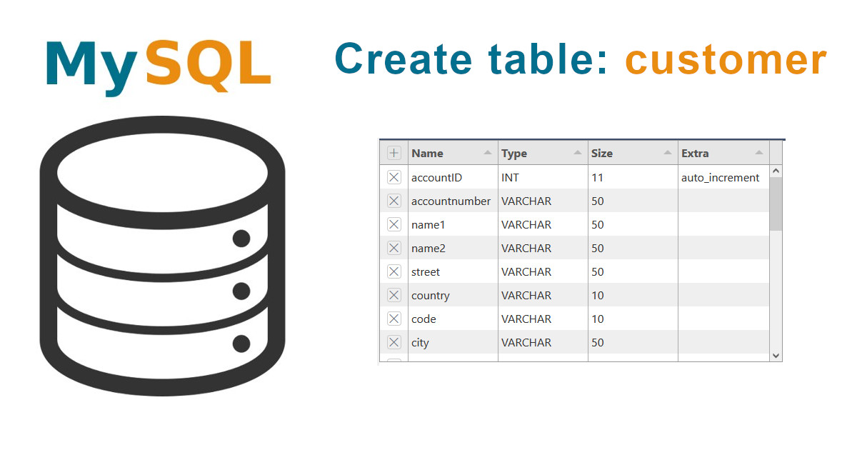
SQL Table
Result:
- A well styled Bootstrap 5 form with CRUD functions
- Ready to use in your web database application
The data type of the form element depends on the database column. As a database app builder, K8 Web Kit starts by creating the table.
Process for the Web form creation
- please login first (register)
- table creation, Elements online
- Create data definition, generation of the basic form with the right data types
- Assitant, starts the Web form assistant with
- layout and
- field configuration
The most common data types are:
- INT: for number without decimals (used also as primary key)
- DECIMAL: for numbers with a fixed maximum of decimals
- VARCHAR: a variable length string with a maximun length
- TEXT: for long strings with a maximun of 65535 bytes
- DATETIME: a date and time combination
More to data types at w3schools MySQL Data Types
Form examples
Stand alone form, floating with inputgroups
| Representation | stand alone form |
| Layout mode | one block layout |
| Form layout | floating |
| Specials | inputgroups tag input |
Representation:
- Stand alone
- Embedded
- Master data form
- Simple data form
- Linked to a catalog
Layout mode:
- One block layout
- Containers with different blocks
Form layout:
- Horizontal
- Vertical
- Floating
Specials:
- Special HTML elements, tags and input types
- Additional libraries: TinyMCE, use-bootstrap-tags, CodeMirror
- Joined fields: user groups, datalist
- Special appearances: input group, with dropdown
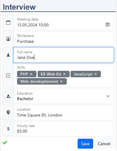
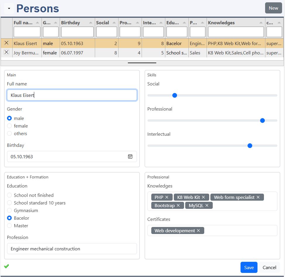
Master data form, horizontal with blocks
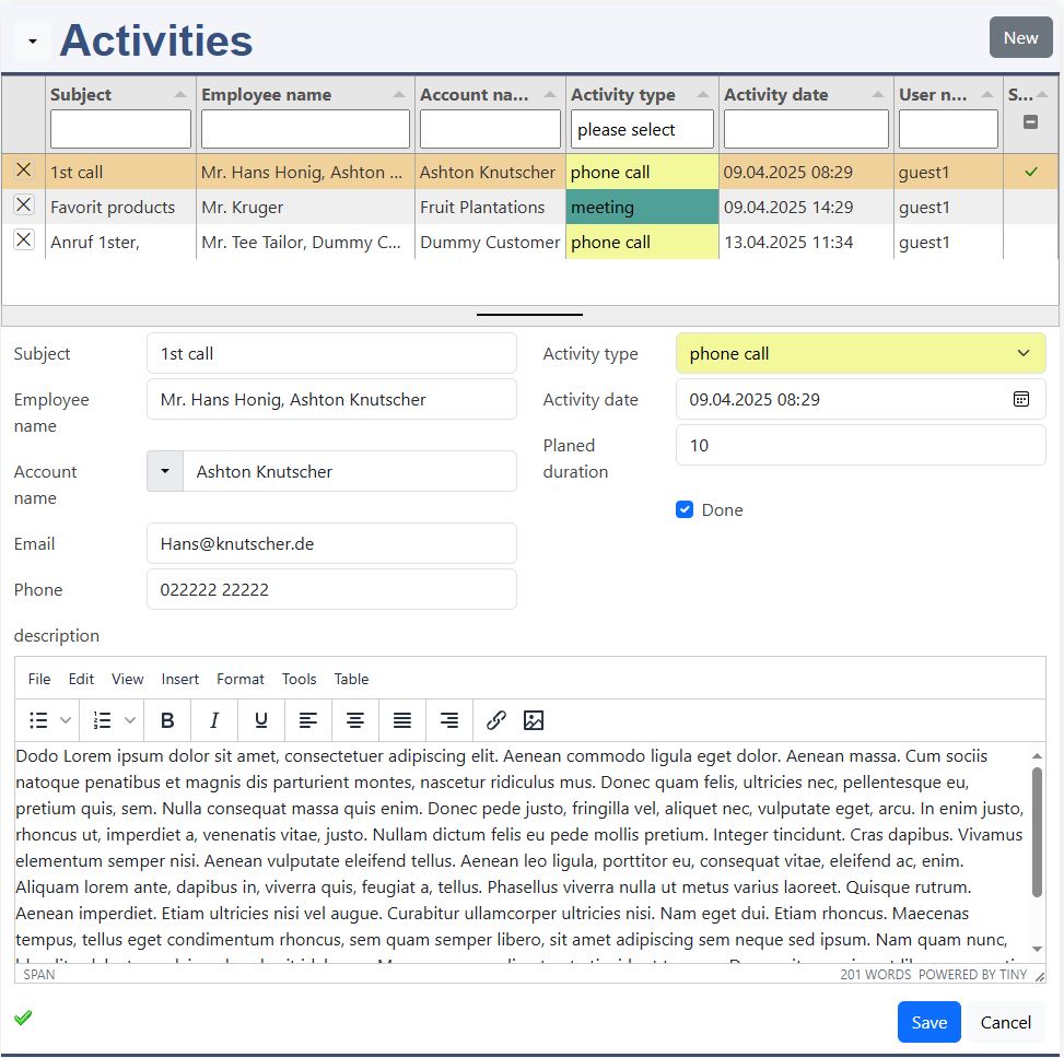
| Representation | master data form |
| Layout mode | container layout |
| Form layout | horizontal |
| Specials | employee datalist account name: dropdown + datalist activity type: user group description: tinymce editor |
Master data form, floating with borderd blocks
| Representation | master data form |
| Layout mode | container layout |
| Form layout | floating |
| Specials | bordered blocks input radio input range tag input |
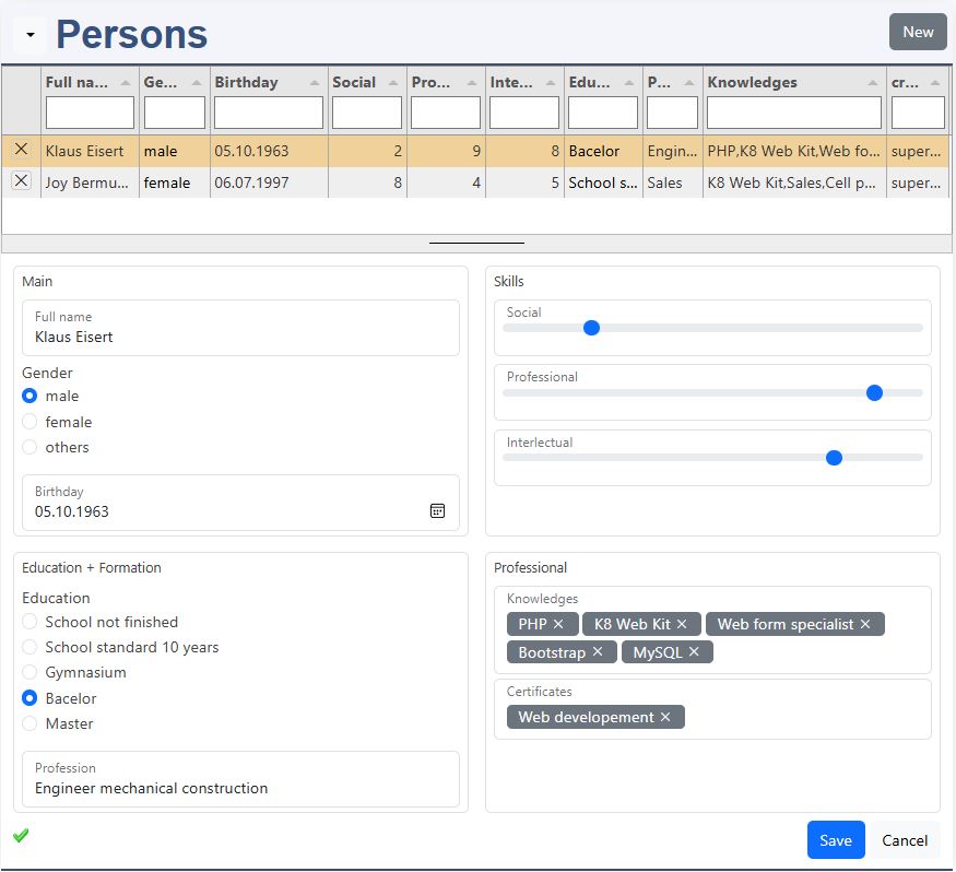
Master data form, vertical with borderd blocks
| Representation | master data form |
| Layout mode | container layout |
| Form layout | vertical |
| Specials | bordered blocks input radio input range tag input |
Form and layout
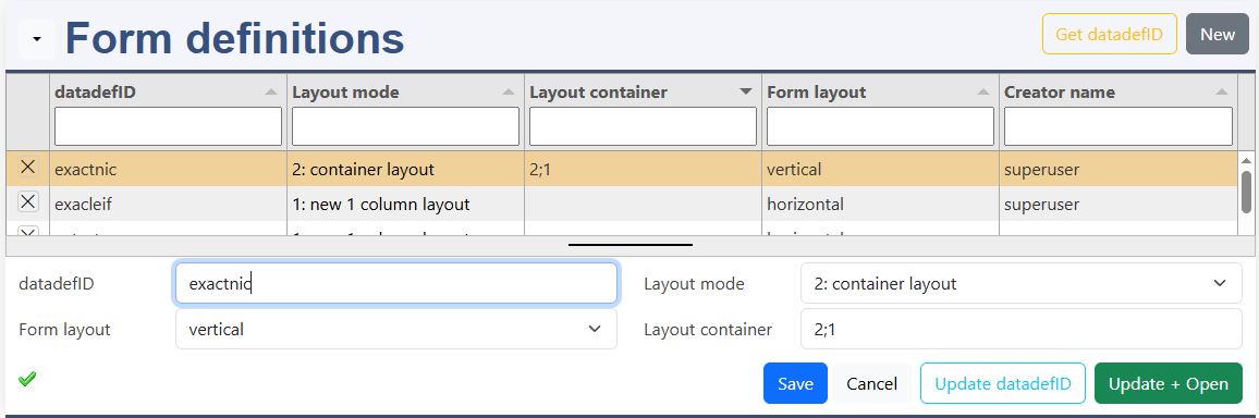
If your datadefID is not listed, enter it the form element datadefID and save it. Then press 'Get datadefID'.
Get datadefID
Get datadefID reads the datadefinition and list the columns in Form elements.
Update datadefID
The definition of k8form, tabulator and columns is saved in the JSON data definition.
Update + Open
The definition of k8form, tabulator and columns is saved in the JSON data definition and the master data form is opened.
This is a beta version! The configuration is yet not limited to the data type of the table column!
datadefID
- Type in your datadefID from elements online.
form layout
- vertical
- horizontal
- floating
layout mode
- 0: inactive
- 1: all fields in 1 block
- 2: container layout (define row and blocks below
Container layout: 2;3
- each number stands for a row:
- first row with 2 blocks
- second row with 3 blocks
Container layout
The container layout allows to define several containers and place the form elements in it. The first digit determines the row. The second digit determines the column.
The block numbers are used to position the fields in the right block.
Each row has a container for the row and a container for each block. For 1 row with 1 block:
This are the standard templates. The settings allows to change the templates and for example use fieldsets.
Columns
The Form elements are a very powerful instrument for configuring awesome forms.
- HTML Form elements
- input, textarea, select
- types
- attributes
- Form elements enhanced functionality
- editor, tinymce
- datalist fields joined to foreign tables
- usergroups
- input groups
Column order: Sort
If you want to place an element in a new position, just write the sort number of the element, you want to put it behind, followed by decimal separator and 1. Go to the Form elements menu and sort new.
Standard HTML Form Elements
The Form elements: tagName
- input & types: Core element for data input
- textarea: Used for multi-line text input (like comments or messages)
- select & option: For a list to select from
- button: Submitting the form or other actions
The Input Types
- Textual Input Types
- text (Single-line plain text input)
- password (Obscures input characters)
- email (Validates email format)
- url (Validates URL format)
- search (Styled for search fields)
- tel (For telephone numbers)
- Numeric Input Types
- number (Numeric input with stepper arrows)
- range (Slider for selecting a numeric value)
- Date & Time Input Types
- date (Date picker)
- datetime-local (Local date and time picker)
- month (Month and year picker)
- week (Week of the year picker)
- time (Time picker)
- Choice Input Types
- checkbox (Allows multiple selections)
- radio (Allows only one selection in a group)
- File & Media Input Types
- file (File upload field)
- image (Submit button with an image)
- Button & Control Input Types
- submit (Submits the form)
- reset (Resets the form fields)
- button (Custom button, often used with JavaScript)
Attribute Dialog
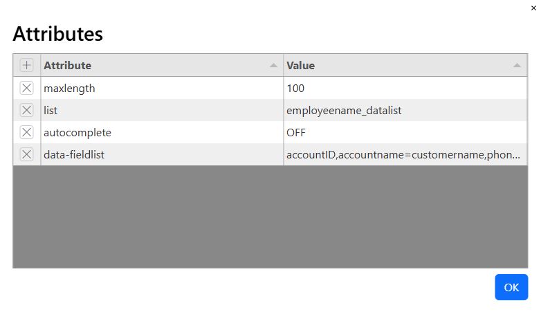
| Attribute | Description |
|---|---|
| type | Specifies the type of input (e.g., text, email, checkbox) |
| name | Name of the input; used in form submission |
| value | Initial/default value of the input |
| id | Unique ID, often used to link label and input |
| class | CSS class(es) for styling |
| placeholder | Text displayed inside empty input |
| required | Makes the field mandatory to submit |
| disabled | Disables the input (can’t edit or submit) |
| readonly | Prevents editing, but allows submission |
| checked | Pre-selects checkbox or radio input |
| selected | Pre-selects an option in a dropdown (` |
| multiple | Allows multiple selections (file or select) |
| autofocus | Focuses the input when the page loads |
| autocomplete | Enables browser auto-fill suggestions |
| min / max | Defines min/max values (for numbers, dates, etc.) |
| step | Sets interval between valid values (e.g. 1, 0.5) |
| pattern | Validates input using a regular expression |
| size | Visible width of the input in characters |
| maxlength | Maximum number of characters allowed |
| minlength | Minimum number of characters required |
| form | Associates input with a form by ID (even if outside) |
| title | Tooltip on hover; useful for pattern tips |
| accept | Allowed file types for file inputs (e.g., image/*) |
| list | Connects input in a <datalist> for suggestions |
Option Dialog
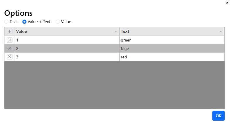
The option diaog is enabled for:
- input: type=radio
- select
- datalist (only values)
For input (type=radio) and select, choose between:
- Text
- Value + Text
To allow empty text for the selection, leave the first line blank.
Datalist Dialog
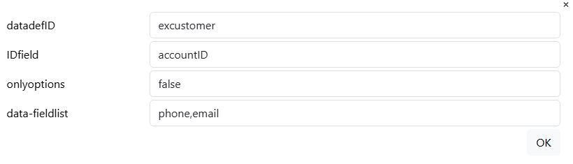
The datalist dialog is only available for special datalist elements, which are joined to foreign data definition.
datadefID
This is the datadefinition, you want to join with.
ID field
This is the field name, which correspond to the primary key column of the source datadefinition.
only options
Only options limits the data entry on records, which are in the source table. Otherwise all entries are allowed.
field list (comma separated string)
The fields need to be form elements. If the column name of the source table is different to your form element name, define it like this:
- <form element name>=<source column name>
The source data definition needs the property datalistcolumn. Your form element is filled with the content of the source datalist column.
Input group Dialog
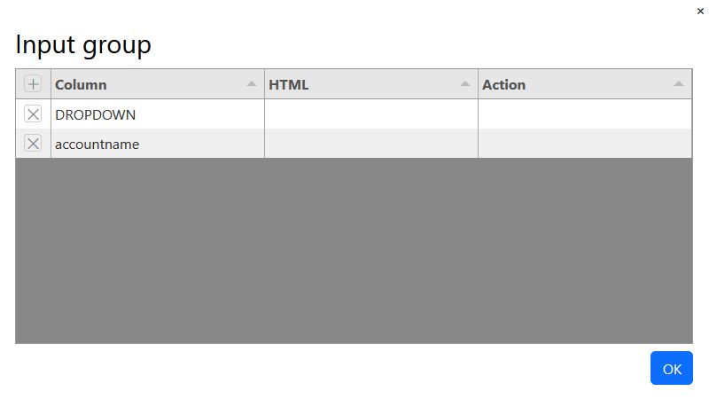
The input group dialog allows you to put a HTML element to the right or left of the input field. If you want to put more than 1 input field in the input group, choose the field type: 1:JSON.
Column
- DROPDOWN: for a dropdown element; add you elements in JSON in the item array. HTML and action is not necessary.
- HTML: add your icon in the column HTML and fill entry.
- <column name>
HTML
Place a Bootstrap Icons into the HTML column like this:
- <i class="bi bi-telephone"></i>
Action
The action value is used in JavaScript for the specific programm code.
Tabulator sub Element
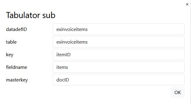
The tabulator sub element need to be a ready defined datadefinition:
- datadefID: the datadefinition for the tabulator element
- table: the name of the sub table
- key: the key of the sub datadefinition
- fieldname: the name of the data array for the sub element
- masterkey: the masterkey is the column with the key of the parent element
∫x Formula assistant
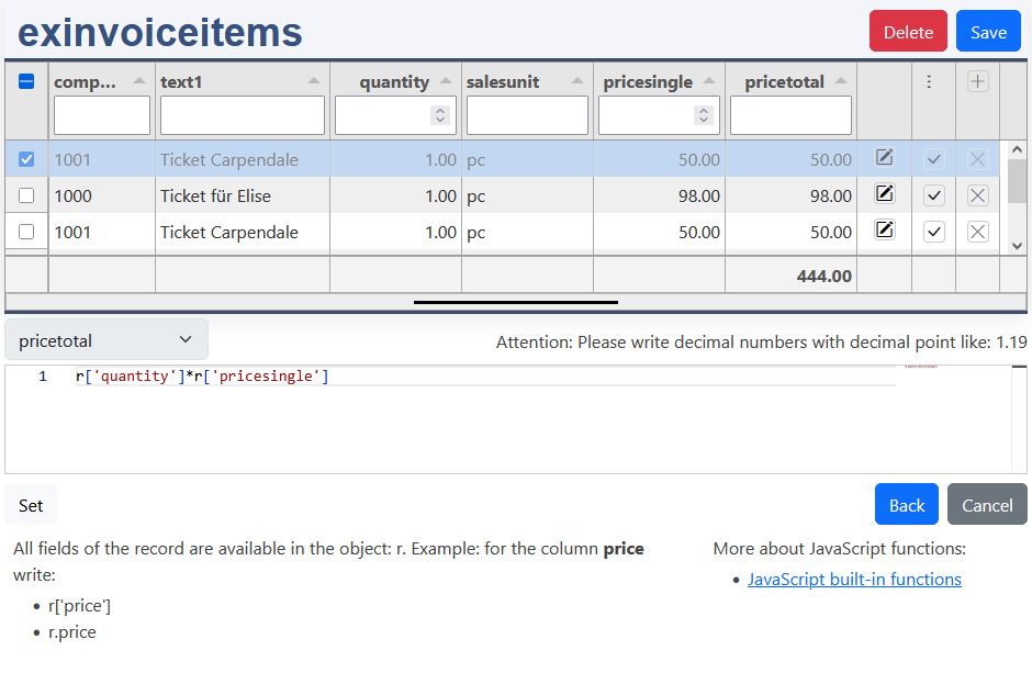
The assitant has 2 parts:
- the list with the columns
- the formula column, here pricetotal, with the formula content area
Process of writing and testing the formula:
- Select first a row to test your formula with the row selector
- the JavaScript formula editor has intellisense support. Insert your columns, operators and JavaScript functions. If something is wrong, you'll get a red, jagged underline. If it's right, press Set
- the value of your column is displayed in the tabulator cell
- with save you can directly store it in the database
Back
The formula is written to the json k8form. Save then the form element. After Updata + Open the formula will work in forms and lists.
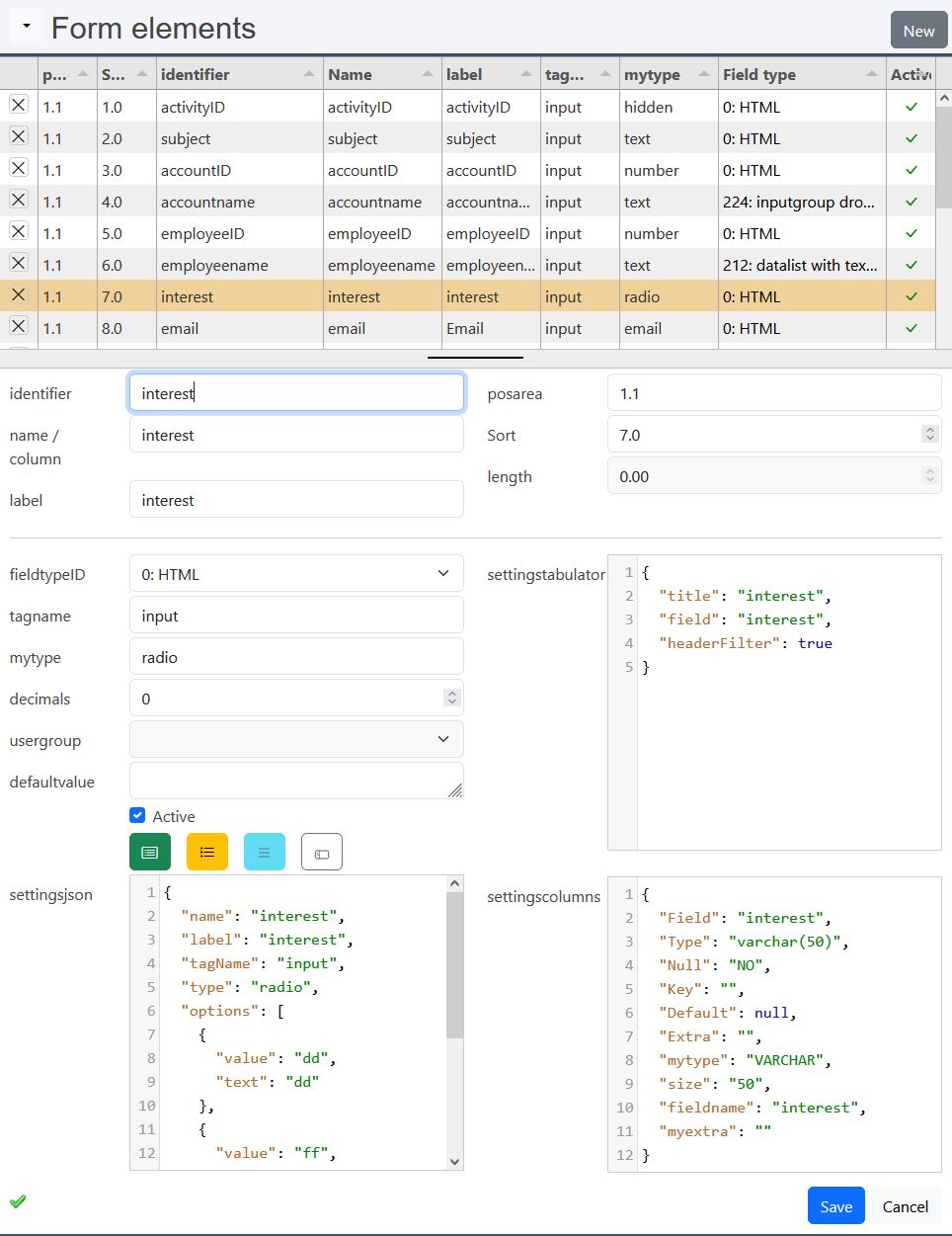
Elements with special features
| Number | Description | Data type | Dependencies |
|---|---|---|---|
| 0 | Form element | ||
| 1 | JSON | ||
| 2 | HTML element | ||
| 141 | Usergroup ID | INT | optionsadditional |
| 145 | optionsadditional | INT | optionsadditional look beneath |
| 151 | Editor TinyMCE | VARCHAR | library tinyMCE |
| 152 | Editor TinyMCE Large | VARCHAR | library tinyMCE |
| 171 | Bootstrap tag | VARCHAR | library use-bootstrap-tag |
| 211 | Datalist only options | VARCHAR | datalist + new SQL column (name = datalistcolumn) |
| 212 | Datalist with text field | VARCHAR | datalist |
| 221 | Inputgroup standard | ||
| 222 | Inputgroup dropdown | ||
| 223 | Inputgroup dropdown + datalist only options | VARCHAR | datalist + new SQL column (name = datalistcolumn) |
| 224 | Inputgroup dropdown + datalist with text field | VARCHAR | datalist |
| 301 | Checkbox K8Form + Tabulator | number |
Elements with special features have the main goals:
- support bootstraps dropdowns and input groups.
- enhance the controls with functioniality of additional libraries.
- join the fields to foreign tables.
Attention: datalist (fieldtypes: 211,212,223,224)
The joined column in the table should be the IDfield. The datalist column is configured like this, fieldtype:
- 211,223, the search column is an additional field! Use the button New to add it to the form:
- identifier / name: datalist column of the joined datadefID
By updating the datadefinition the sql statement is also extended with the datalist column of the joined datadefID
- identifier / name: datalist column of the joined datadefID
- 212,224:
- identifier / name: datalist column of the joined datadefID
sql_additionals
For fieldtype 211 and 223 the new field is added automatically to sql_additionals, if it's not added yet. Fhe field is added like this:
- select:
- foreign table.column as column
- from:
- LEFT OUTER JOIN foreign table ON this_table.IDfield=foreign_tabe.key
If the datalistcolumn of the linked datadefinition is not equal to your "column name", you have to overwrite the select expression manually.
fieldtype: 145, optionsadditional:
tag Name: select
JSON k8form, please configure it manually:
- datadefID: <your datadefID>
- column_mapping
- value: <key column of your table>
- text: <displayed text>
fieldtype: 211, datalist only options:
If you need to join a foreign table and enter the values of it in your form, do the following:
- select the column with the foreign ID: accountID
- if you don't need it to be displayed:
- type: hidden
- JSON tabulator, add: ,"visible": false
- Save
- Form elements: New join
- datalist dialog opens
- choose your datalist
- Ok: the new field is inserted in the form
- Save
- Sort
- Update + open
fieldtype: 211, joined tables:
| exinvoice | excustomer | |||
|---|---|---|---|---|
| table columns | datalist: name1 | comment | table columns | datadefID |
| docID | key | |||
| docnumber | ||||
| accountID | IDfield | joined | accountID | key |
| name: name1 | sql additional | name1 | headtitlecolumn, datalistcolumn | |
| ... | ... | |||
The main table / datadefID is:
- exinvoice
The joined table / datadefID is:
- excustomer
The tables are joined by the column accountID. The column name1 only exist in the customer table. It is joined with the sql statement. It's also added in the form with an additional datalist field.
fieldtype: 211, sql statement:
This is the sql statement to join both tables. It is created autotmically by the definition beneath.
datadefinition: masterdata:
In the datadefinition the joined table are defined by:
- sql_additionals
- select
- column: expression
- from
- table name
- join expression
- table name
- select
JSON Tabulator
tabulator, basics
This is a part of the customer tabulator definition (string columns):
The most often used column properties are:
- title - Required This is the title that will be displayed in the header for this column
- field - Required (not required in icon/button columns) this is the key for this column in the data array
- headerfilter - true for more details look in the tabulator documentation
- visible - (boolean, default - true) determines if the column is visible
- hozAlign - sets the horizontal text alignment for this column (left|center|right)
- headerHozAlign - sets the horizontal text alignment for this columns header title (left|center|right)
- width - sets the width of this column, this can be set in pixels or as a percentage of total table width (if not set the system will determine the best)
- minWidth - sets the min width of this column, this should be set in pixels
- formatter - Tabulator offers a wide range of formatters for strings, numbers, dates, ...
- formatterParams - additional parameters you can pass to the formatter
For more details look to:
Columns can easily removed or added. if desired you change the order of the columns. If you extend the sql-statement, you can easily add the columns here.
tabulator, local formatting
Example for date and number:
The formatting of dates and numbers depends on the settings of the clients web browser. K8 Web Kit reads this on the first page request and sets it in the session variables. This are the corresponding JavaScript variables:
- GLOBALS_decimal_point
- GLOBALS_thousands_sep
- GLOBALS_tabulatordateformat
- GLOBALS_tabulatordatetimeformat
- GLOBALS_tabulatortimeformat
The date and time formats follow the luxon syntax, date time format:
- 'dd.MM.yyyy HH:mm'