 " id="k8-modal-content" alt="modal">
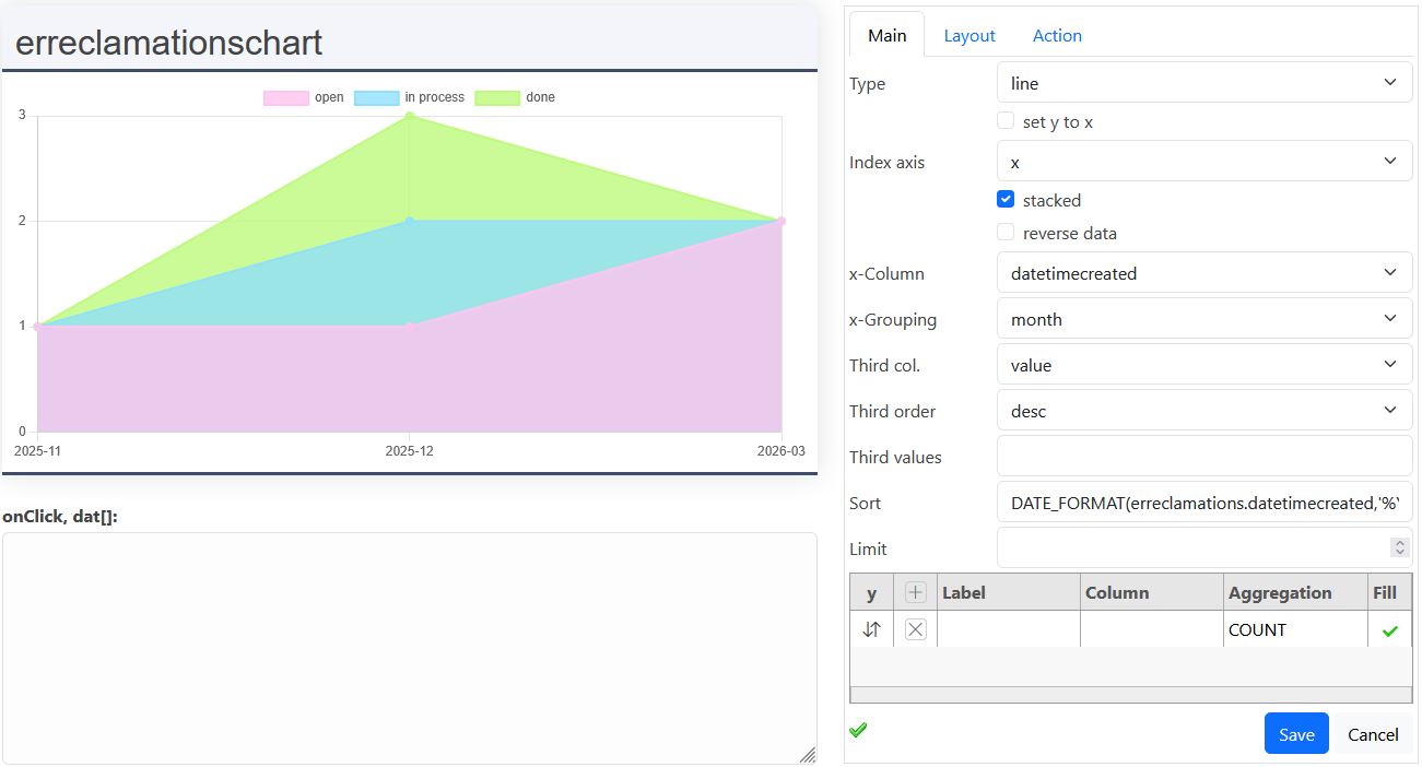
The Diagram Assistant makes it easy to create data-driven charts from your database. Select the columns you want to visualize, define how the data should be grouped or aggregated, and see the result immediately in a Chart.js preview.
It supports common chart types such as bar, line, pie and doughnut charts, including filters, multiple data series and additional dimensions for comparing data.
No separate chart programming is required for the basic configuration. The assistant translates your selections into the corresponding chart and SQL configuration.
Introduction
This basic chart assistant helps you to choose the table columns for your graph. You need to have the role 'superuser'. Attention, grouping the data changes the sql-statement. Note, that in this case, a special data definition must be created specifically for Chartjs.
Appearance and Filter
Chartjs allows max more configurations. You can do this in the chartjs section of your datadefintion. The filter can be defined in the filterobject of the chartjs_def section.
More details
Register Main
Type
- bar
- line
- doughnut
- pie
Set y to x
For pie/doughnut charts with a single row and multiple y columns: turns each y column into its own slice, using the y-labels as the slice labels.
Index axis
The default index axis is x. Choosing y will rotate the graph gy 90 degrees.
Stacked
Stacks the y data sets of a bar or line chart on top of each other instead of side by side.
Reverse data
Reverses the order of the returned records before charting, which flips the direction of the x axis.
x-Column
This column will be displayed on the x axis.
x-Grouping
- no aggregation
- group column
- year (only date)
- month (only date)
- day (only datetime)
- hour (only datetime)
If k8form is in the datadefintion only "no aggregation" is allowed, because the aggregation changes the sql-statement.
Third col. / Third order / Third values
Configures the third dimension (color) of a chart, see The third dimension beneath.
Sort
Attention, you have to enter a correct sql order by expression. Otherwise it will cause an sql error and the graph stays empty.
Limit
The chart panel has a fixed size. By height data volume it's better to limit the recourd count.
Register Main Y
You can declare multiple y data sets. Be aware, that they all have to fit to one y axis.
y-Label
This is the displayed label in the graph (legend).
y-Column
Choose the column from your table for the y data serie.
y-Aggregation
- value: the native value is displayed
- SUM: returns the total sum of a numerical column
- COUNT: returns the number of rows in a set
- AVG: returns the average value of a numerical column
- MIN: returns the smallest value within the selected column
- MAX: returns the largest value within the selected column
y-Color
For bar and line charts the color of the y data set can be defined here. By pie and doughnut the colors are automatically set for each record.
y-Fill
Fills the area beneath a line.
Register Layout
Height [px]
Here you can set the height of your graph in pixels. 100px are about 5cm on your screen, depending on the resolution.
Title
The title is centered just above your graph.
Legend pos.
- top
- left
- right
- bottom
- chartArea
Reverse
Reverses the order of the entries in the legend.
x Axis text
This text describes the values of the x axis.
y Axis text
This text describes the values of the y axis.
Bg Opacity
The default opacity is 0.2. To make the color strongest, enter 1. The opacity only has an effect by explicit choosen colors, not on the default colors of chartjs.
Colors
Overrides the default chartjs color sequence with your own colors, used for the y data sets (bar/line) or the slices (pie/doughnut).
Display y
The y values are displayed in your graph.
Today line
Draws a vertical line at today's date on the x axis (only useful for a date/time x-Column).
Register Action
Action type
- no action
- url in new tab
- edit in overlay
- self programmed (not yet available)
Url
This url will be called by clicking on the graph. For details look beneath Click on the chart.
edit datadefID
The datadefID need to be added in the settigsadditionals. By clicking on the graph the edit form will be opened.
Open link
Only relevant here in the assistant: when checked, clicking the preview graph actually follows the action Url. When unchecked, the clicked record's data is only shown in the onClick, dat[] box above, without navigating away.
Mode 1: datadefID without configuration
Main caracteristics
- no configuration
The action type: "edit in overlay" is available.
The numeric columns of the datadefinition are shown as bar.
The head title column is used as value for the x-axis.
Examples
Mode 2: datadefID with chartjs assistant
Main caracteristics
- with configuration
- no grouping
- date entry by master data possible
Please, fill out:
- x-column: <your column, like title or name>
- x-grouping: "no aggregation"
- y:
- column: <column with value for y>
- aggregation: "value" (no aggregation)
Examples
Mode 3: Special data definition with grouping
Main caracteristics
- purpose: chartjs
- with grouping
- no data edit with this datadefID
Empty x-column
By an empty x-column the aggregation includes the whole recordset. The x label is: all.
Create a new data definition:
- purpose: chartjs
Example, grouping invoices is interesting:
- monthly
- by customer
Fill in at least these fields:
- x-grouping
- y
- column, if aggregation is not "count"
- aggregation
Examples
- doughnut: Strengh of low code (x-column is empty), erchartjsgroup
- horizontal bars: customer top 10, exturnover
- bars, sales volume and turnover per month, exturnvolume
- pie: favorit categories erbookingscount
Mode 4: special aggregation columns
Aggregat columns in the data defintion:
In the y-list you can add datasets manually. Each line represents one data series (description above).
If you need to create new sql columns for it, you can add them in sql_additionals in the aggregat section.
Examples:
- requests by processing status: k8requestsm
Aggregat columns in the columns definition:
columns
The new sql-columns needs to be added in the columns array.
third values
Each y columns adds a dataset. The values are entered for the third column.
Mode 5: third dimension: color, one y
The third dimension of a chart is the color. It's great to compare different datasets. Each color is explained with a legend. But too many colors are confusing. Chartjs has 7 default colors. Please take care that a third column not creates too many data series.
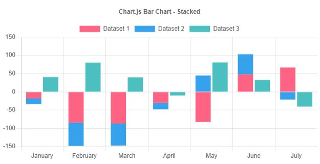
You can limit the third dimension by creating an aggregation in the SQL statement.
Another possibility is to join a colored group with only a few entries. This allows also to display the chart in the colors of the group.
The third column
By filling out the Third column the data is send with the structure beside. The datasets are build just before displaying the chart.
The y axis just need one column and aggregation function. Label and color are taken from the sql statement, if available.
The data with the third dimension:
Third column, label for option list
option list manual filled
If you have an option list, for example column status, with numeric values and you want to display text values:
- 0: new
- 1: in process
- 2: done
- 3: success
Just add a column in the sql additionals like this in the example. Call the example:
- filled line chart: k8requestsassist
The data with the third dimension:
Third column, SQL-statment and columns
If you want to aggregate columns from foreign tables, you need to:
- add them in the columns array, for example categoryID
- link them in sql_additionals
If you use the third column, you need to provide additional columns in the sql statement; column:
- label: for the legend
- backgroundcolor: as chart element color
Example:
- turnover by category: bar chart: exturncat
The data with the third dimension:
Mode 6: manual data definition
The data definition: k8requestmonth for a stacked line chart:
Examples
- requests stacked line: bar chart: k8requestmonth
Filter form
The filterform allows to configure a filter.
In this example the column "datetimecreated" is configured with a range: from / to ("figure": 2).
This filter is send to the server. In some cases the sql statement has to regard the table name. Attention: change the table name to your table.
More to filterforms:
Default values:
- 1 field
- value
- 2 fields, from / to
- valuefrom
- valueto
In this example 2 years are subtracted from the current date and the valuefrom ist set.
Click on the chart
The data behind a chart element (example):
The data depends on the sql statement. This columns are added automatically:
- chart_datasetIndex: the index of the dataset
- chart_Index: the inex of the chart element
Action
- no action
- url in new tab
- self programmed
Url normal
Url SEO friendly
The 2 parts left and right from the ?:
- left: element
- right: query string
Left, the element
- e: element
- K8 element: masterdata, list, form, ...
- datadefID
Right, query string with chart2filters()
chart2filters() contains the fields like this:
The fields are separated by '|'. Eeach field can conain 3 parts:
- property of charts element
- operator
- normal: >=, <=, =, like
- special =>=: creates a date range out of a month
- field for the filter of the called element